WindowsUIButtonPanel Class
In This Article
Allows you to create Windows UI flat buttons.
Namespace: DevExpress.XtraBars.Docking2010
Assembly: DevExpress.XtraBars.v24.1.dll
NuGet Package: DevExpress.Win.Navigation
#Declaration
public class WindowsUIButtonPanel :
    XtraControl,
    IWindowsUIButtonPanelOwner,
    IButtonsPanelOwner,
    IStringImageProvider,
    ISupportLookAndFeel,
    IToolTipControlClient,
    IButtonPanelControlAppearanceOwner,
    IAppearanceOwner,
    IButtonsPanelGlyphSkinningOwner,
    IXtraResizableControl,
    IPagerControl,
    ISupportDXSkinColors,
ISupportImageDragDrop#Remarks
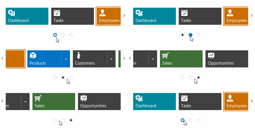
The WindowsUIButtonPanel is a container for Windows 10-style buttons and separators. See the WindowsUI Button Panel article to learn more.

#Pager Navigation
The RadioGroup and WindowsUIButtonPanel can be used as a pager for the following controls:

The pager automatically splits the target control’s content into pages, and displays navigation buttons to scroll to corresponding pages. The pager navigation functionality is implemented as a Behavior and can be added to your controls using the BehaviorManager component.
#Implements
#Inheritance
See Also